PROJECT TITLE:
Seattle Restaurant Promotion:
Three Mini Product Matchbooks Design for Shiro’s, Seattle, WA
TIMELINE:
3 weeks
ROLES:
Advertising, Packaging Design
SKILLS:
Photoshop, Illustrator, InDesign, Acrobat DC
PROBLEM:
How to design Advertising, Packaging Design
PROJECT GOALS AND OBJECTIVE:
The food and beverage industry often incorporates promotional items into their marketing STRATEGY: Every patron that walks through the doors is an opportunity to promote the restaurant. Shiro’s has been a Belltown establishment for over 20 years, and as a Japanese American, I wanted to support their business.
PROCESS:
Research and visit restaurant manager.
SOLUTION:
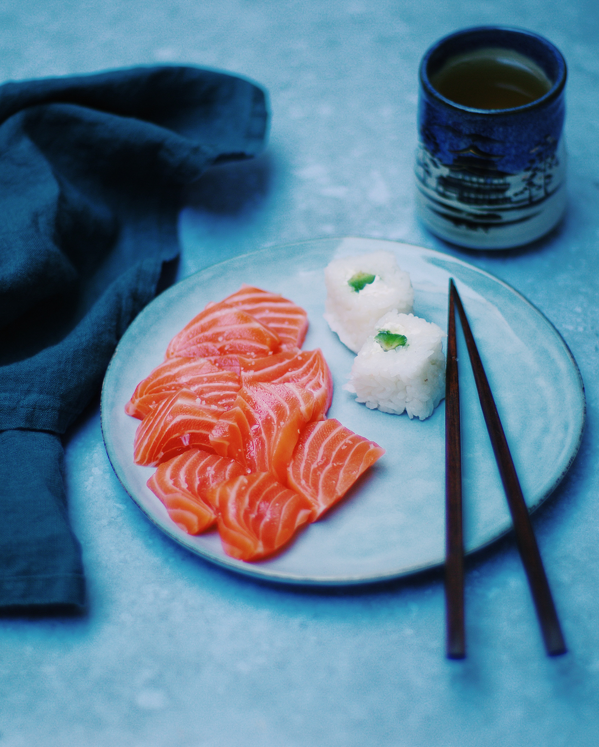
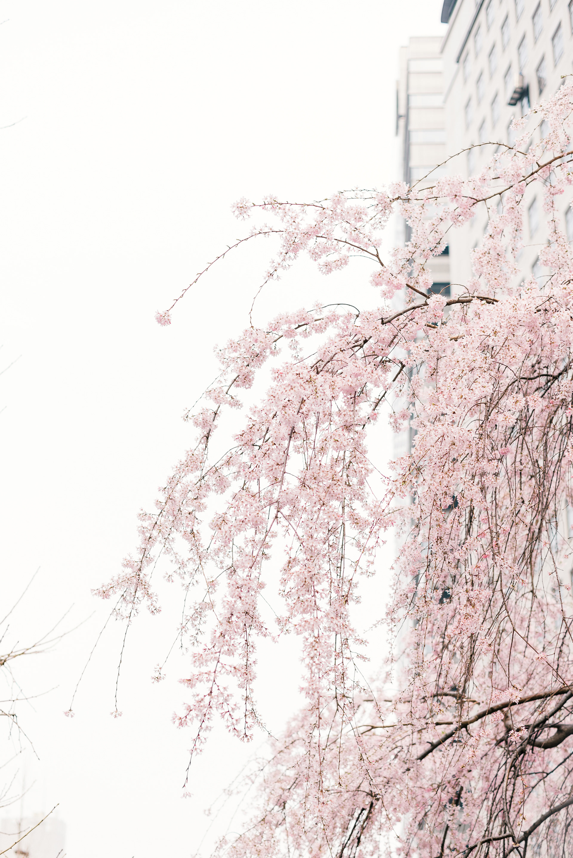
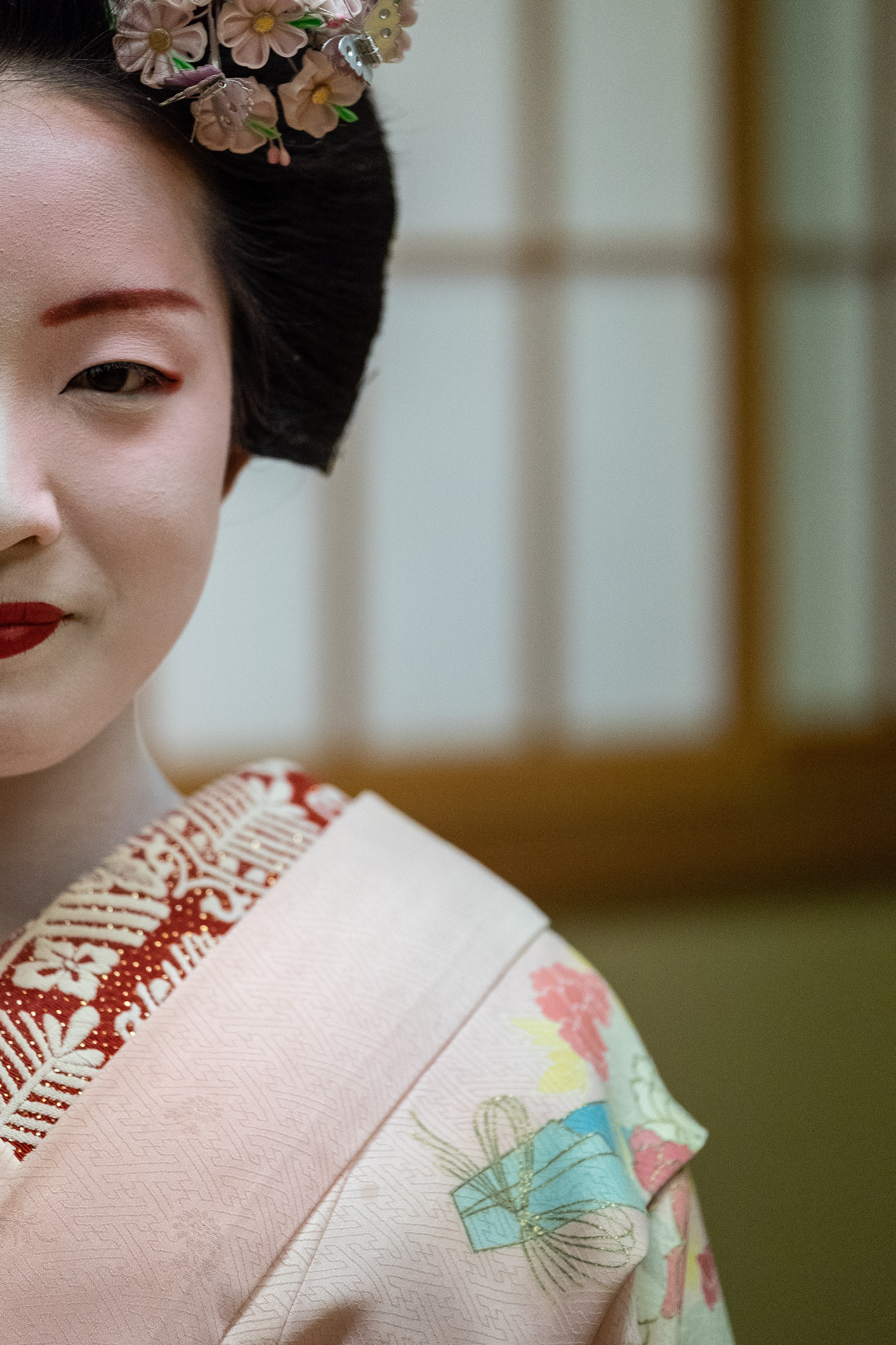
Used blending of classical Japanese techniques, calligraphy and woodblock printing, and the esthetic of the Pacific Northwest’s local seafood image.
PROJECT SUMMARY
I have a great deal of respect for Shiro, whose Belltown Sushi restaurant has been a local institution for over twenty years. Shiro's logo and design choices reflect the importance of the "oldest colors" of Japan to him and his aesthetic choices. The earliest written history of Japan mentions the four oldest colors: red, black, white, and blue, and these colors are used in Japanese Washi, which is traditional Japanese paper. Thus, the use of both washi and these colors has a strong feeling of being Japanese. Shiro utilizes this in his own space, and I wanted to incorporate into my design for his logo, which uses original and modified color and texture.
I have a great deal of respect for Shiro, whose Belltown Sushi restaurant has been a local institution for over twenty years. Shiro's logo and design choices reflect the importance of the "oldest colors" of Japan to him and his aesthetic choices. The earliest written history of Japan mentions the four oldest colors: red, black, white, and blue, and these colors are used in Japanese Washi, which is traditional Japanese paper. Thus, the use of both washi and these colors has a strong feeling of being Japanese. Shiro utilizes this in his own space, and I wanted to incorporate into my design for his logo, which uses original and modified color and texture.


Matchbooks design
Matchbooks design
