

Web design
Digital marketing promotional video
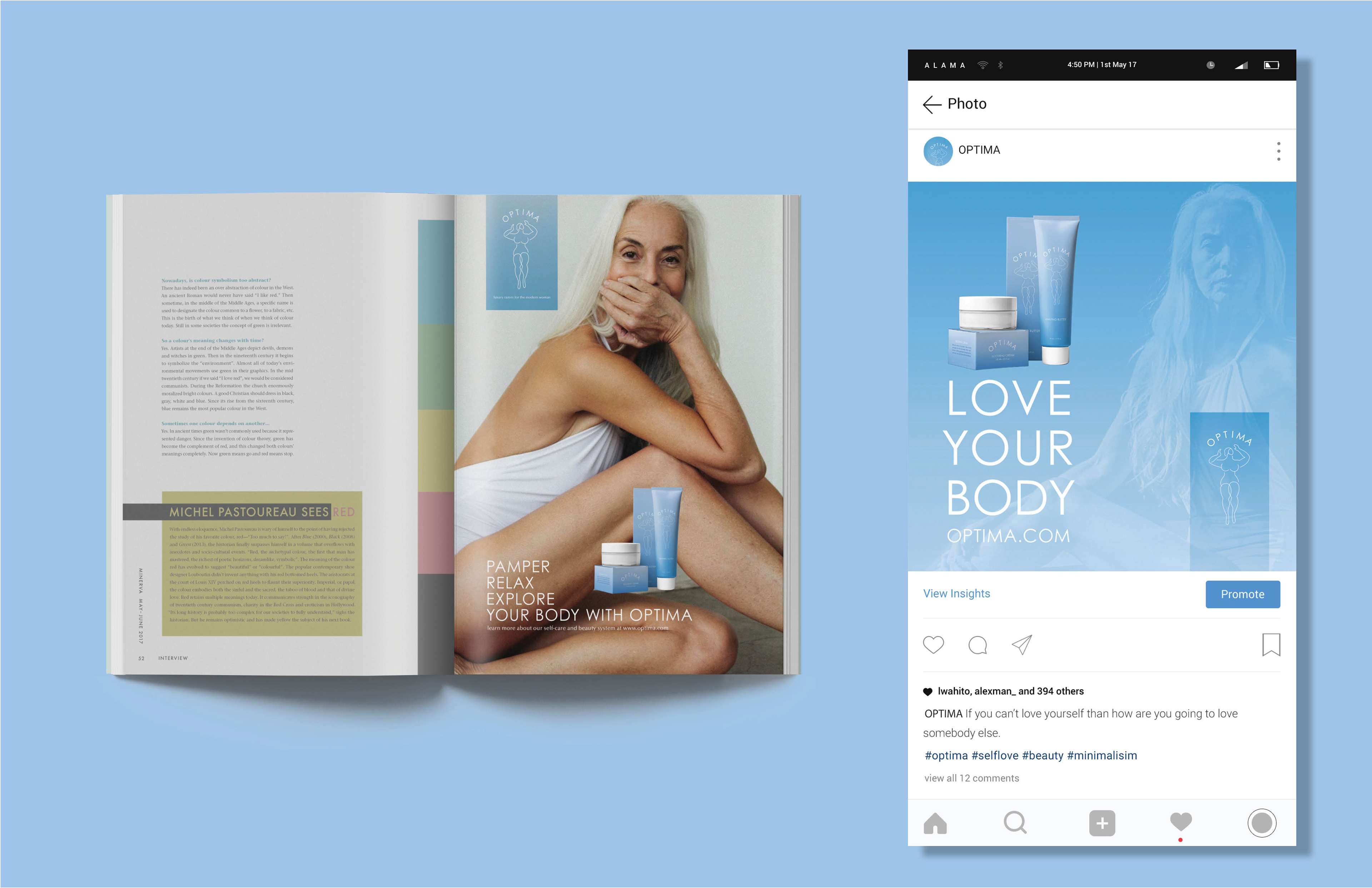
Advertising for magazine and Instagram
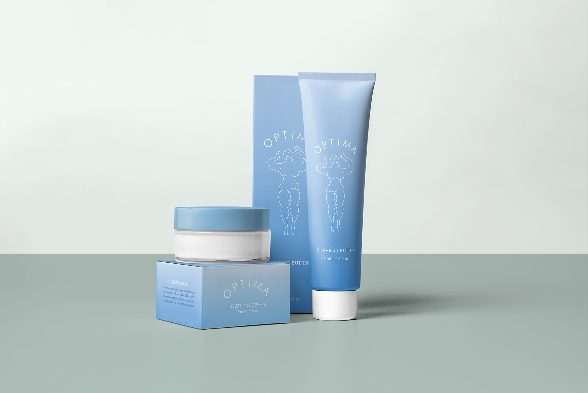
Packaging design
PROJECT TITLE:
Optima - Women's’ shaving for 40’s - 70’s
TIMELINE:
10 weeks
ROLES:
Customer Discovery Map, Branding Content Strategy, Art Direction, Landing Page, Motion Graphics
MY ROLE:
UX, Creative Direction
Led and managed UX in Branding project. Partnered with Kirk Damer to set strategy, design approach & creative staff. Responsible for final strategy, design and implementation.
SKILLS:
Photoshop, Illustrator, InDesign, Acrobat DC, Dreamweaver CC, After Effects
PROBLEM:
Women in our targeted age group want to look beautiful, but they don't want to be treated like girls. We need to give them confidence and respect at the same time.
PROJECT GOALS AND OBJECTIVE:
Our objective is to better understand the attitude of women who are in their 40's and above towards shaving and to understand how those women would respond to a subscription service for razors that targets their age groups.
PROCESS:
Research and Create survey of women ages 40 and above regarding their shaving habits. Our curated design system is Clean, Stylish, Sophisticated, and Confident.
SOLUTION:
We are conducting a market survey of women ages 40 and above regarding their shaving habits and feelings towards women's shaving options. Our content strategy targets consumers and customers domestic across every channel and customer touch point - retail, landing page, social, packaging and events.
COLLABORATORS:
Akiko Masker – Creative Direction, UX / UI
Kirk Damer – Art Direction
Project Summary
Survey Results
We surveyed middle life women (40’s -70’s) about shaving. They have more life experience and personal and financial independence but lose confidence because of ageism. They’re looking to regain this confidence. Our brand needs to feel like a luxury product. It needs to promote intimacy, inspire autonomy, and have a sophisticated ambiance.
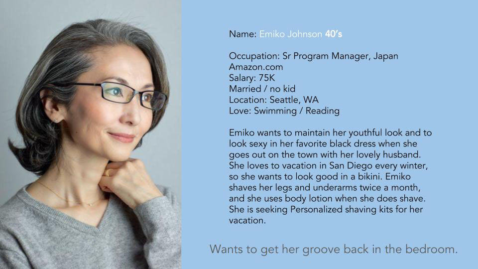
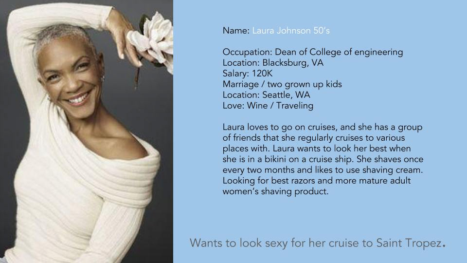
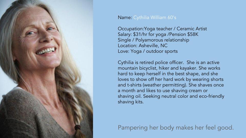
Persona
Customer Discovery Map


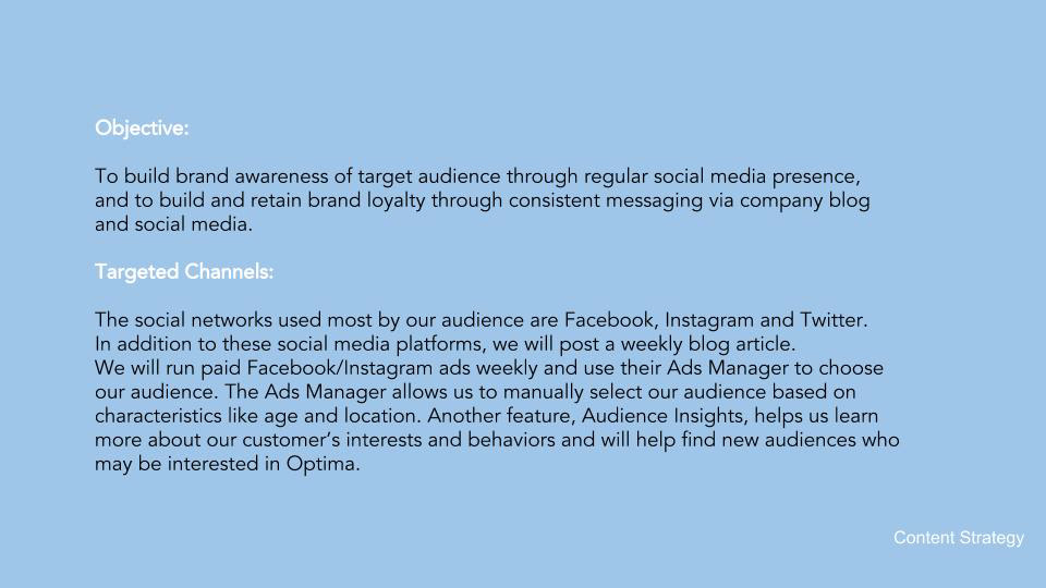
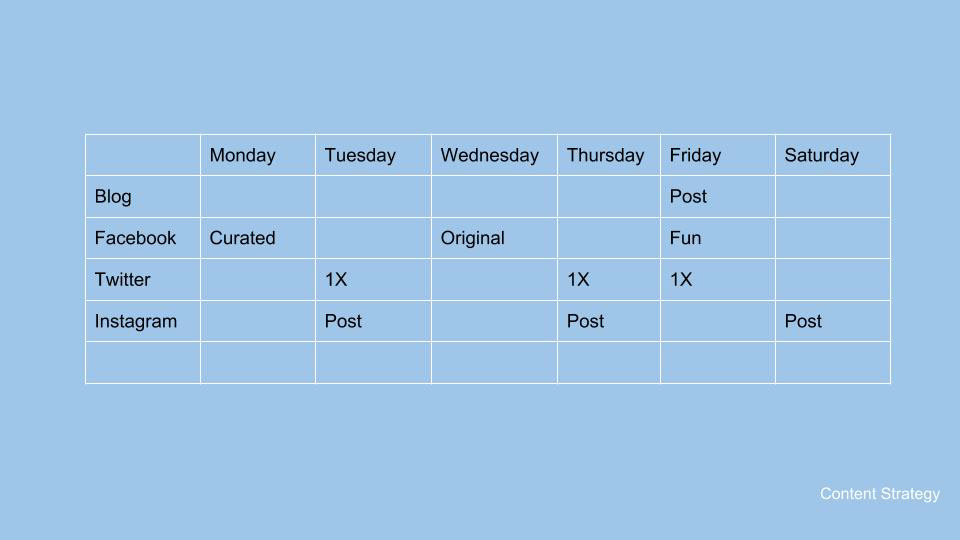
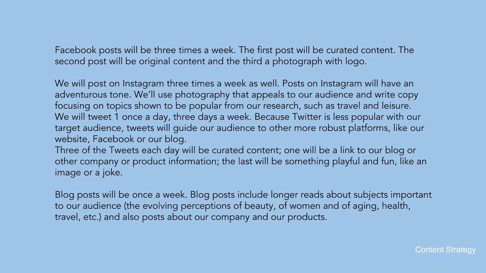
Content Strategy
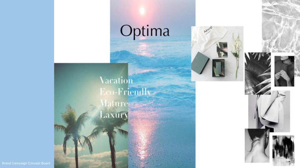
ART DIRECTION
We responded to the research with the concept “smooth sailing”.
To us, smooth sailing means independence, sensuality, relaxation, luxury, exploration and self discovery. Our design system is minimal (simple and clean) and sophisticated and
doesn’t rely on tired ideas of what is “ feminine”.
Brand Tonal Territories : Intimacy, Luxury, Autonomy sophistication

Brand Campaign Concept Board
Smooth Sailing
Smooth Sailing
Smooth Sailing means independence, sensuality, relaxation, luxury, exploration and self discovery. Our design system is minimal and sophisticated and doesn’t rely on tired ideas of what is “ feminine ”.
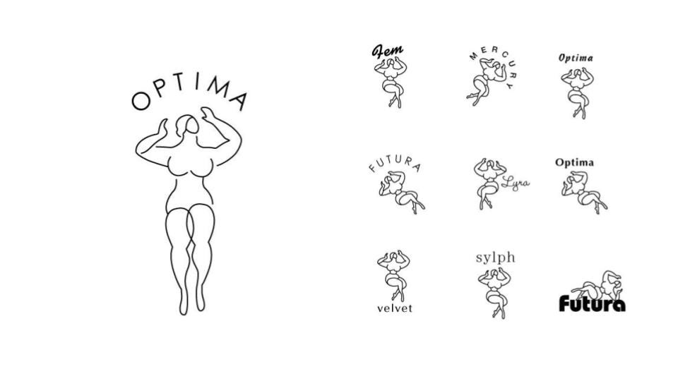
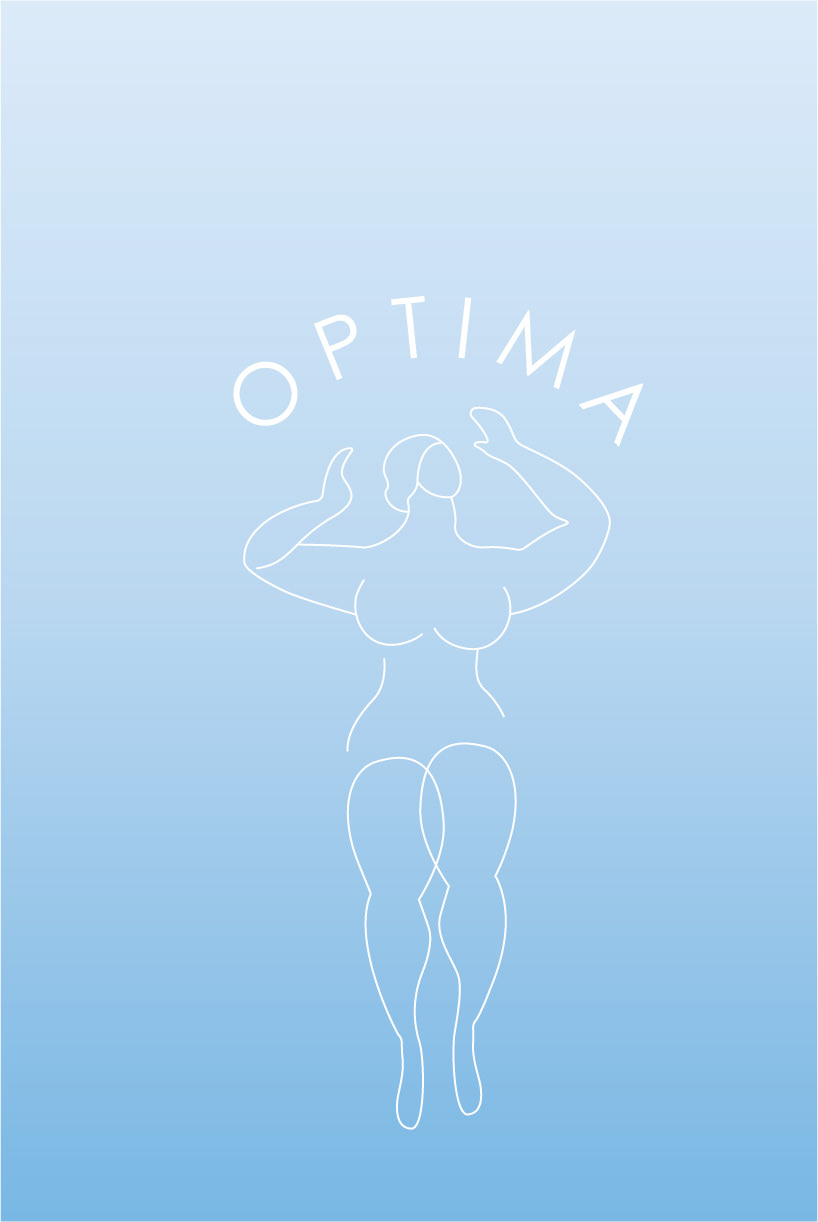
Logo design
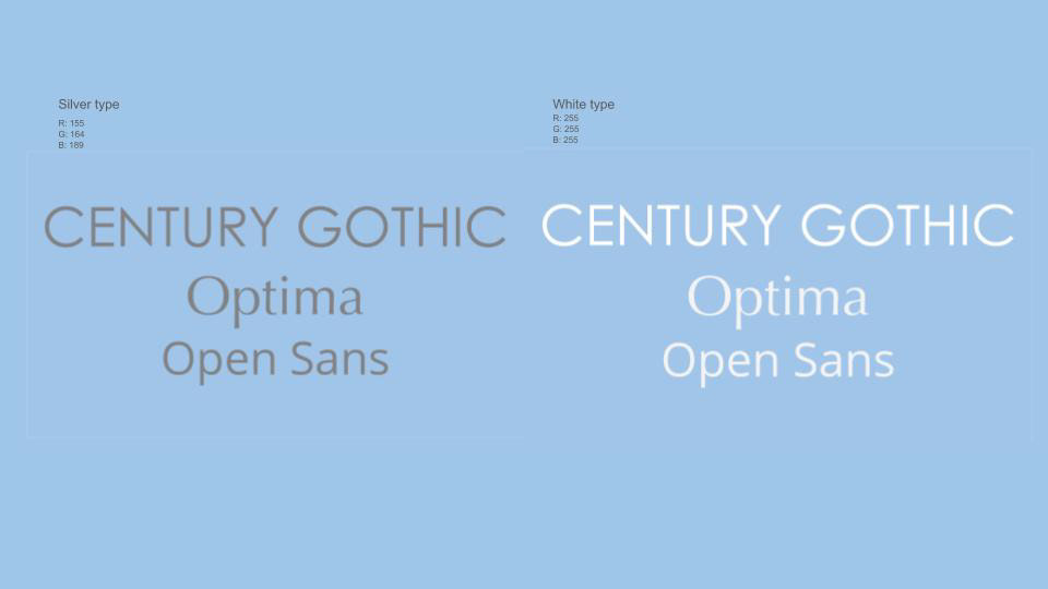

typography
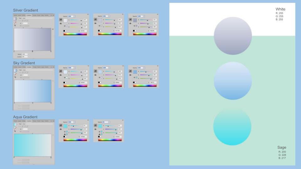
Color palette
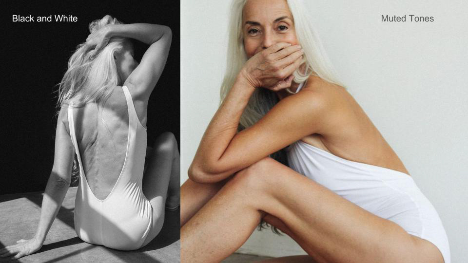
Photo direction A
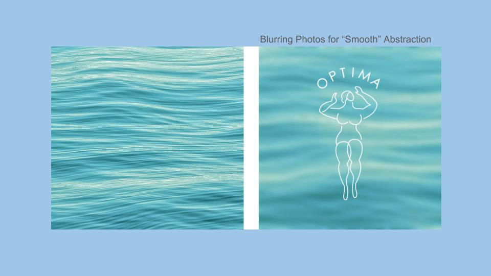
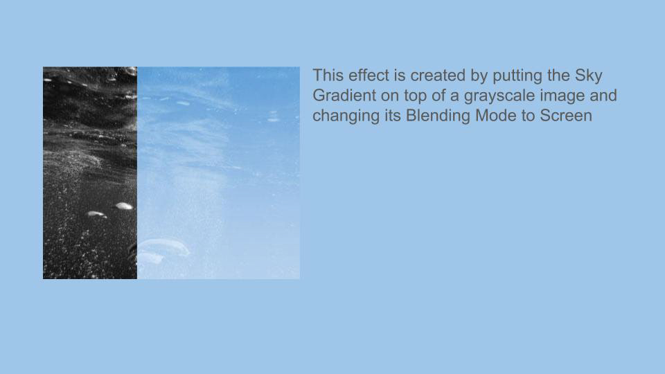
Photo direction B
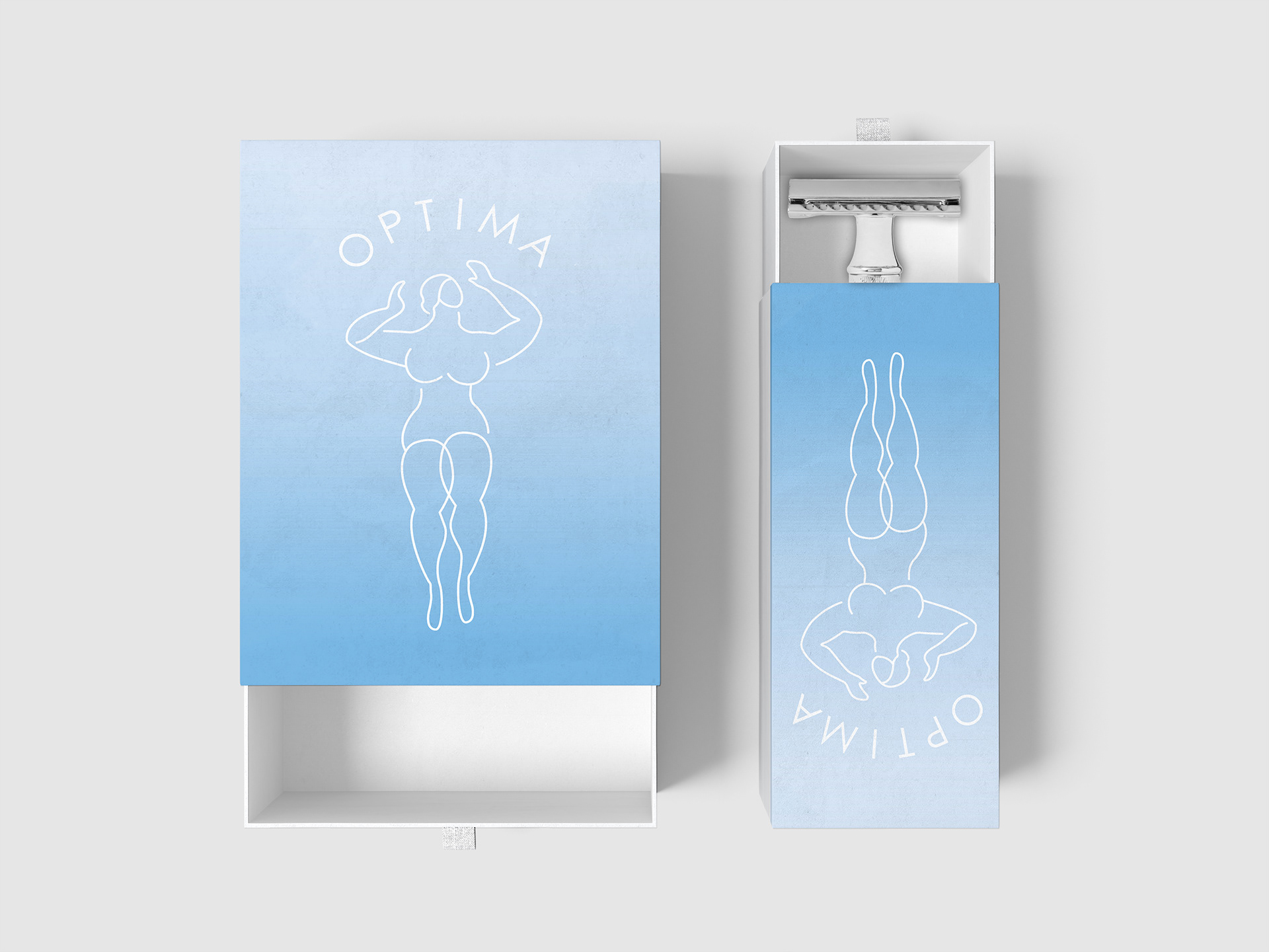
Packaging design A

Packaging design B
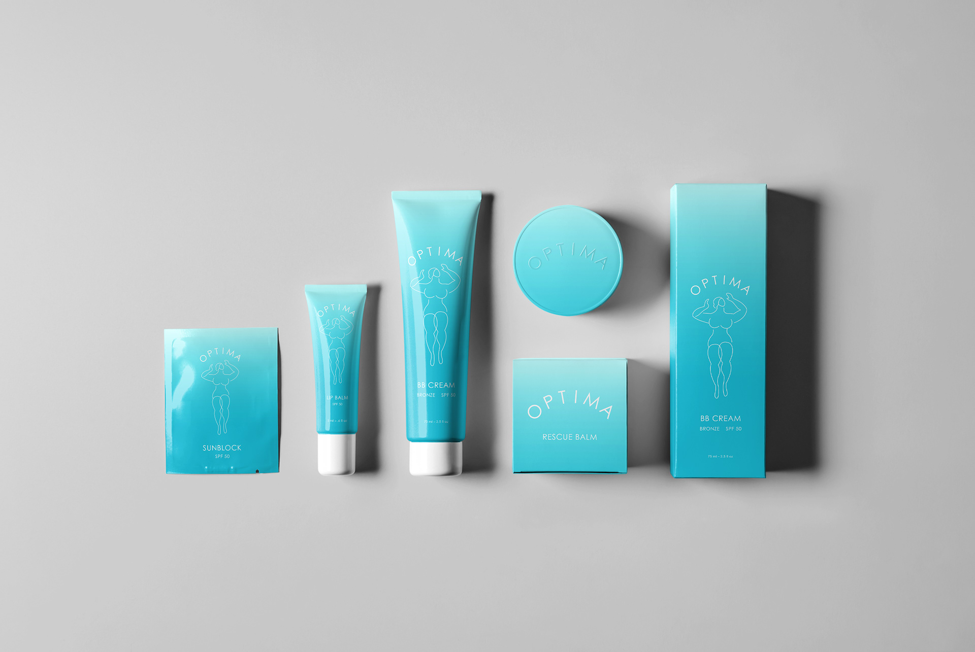
Packaging design for a Sunny Vacation
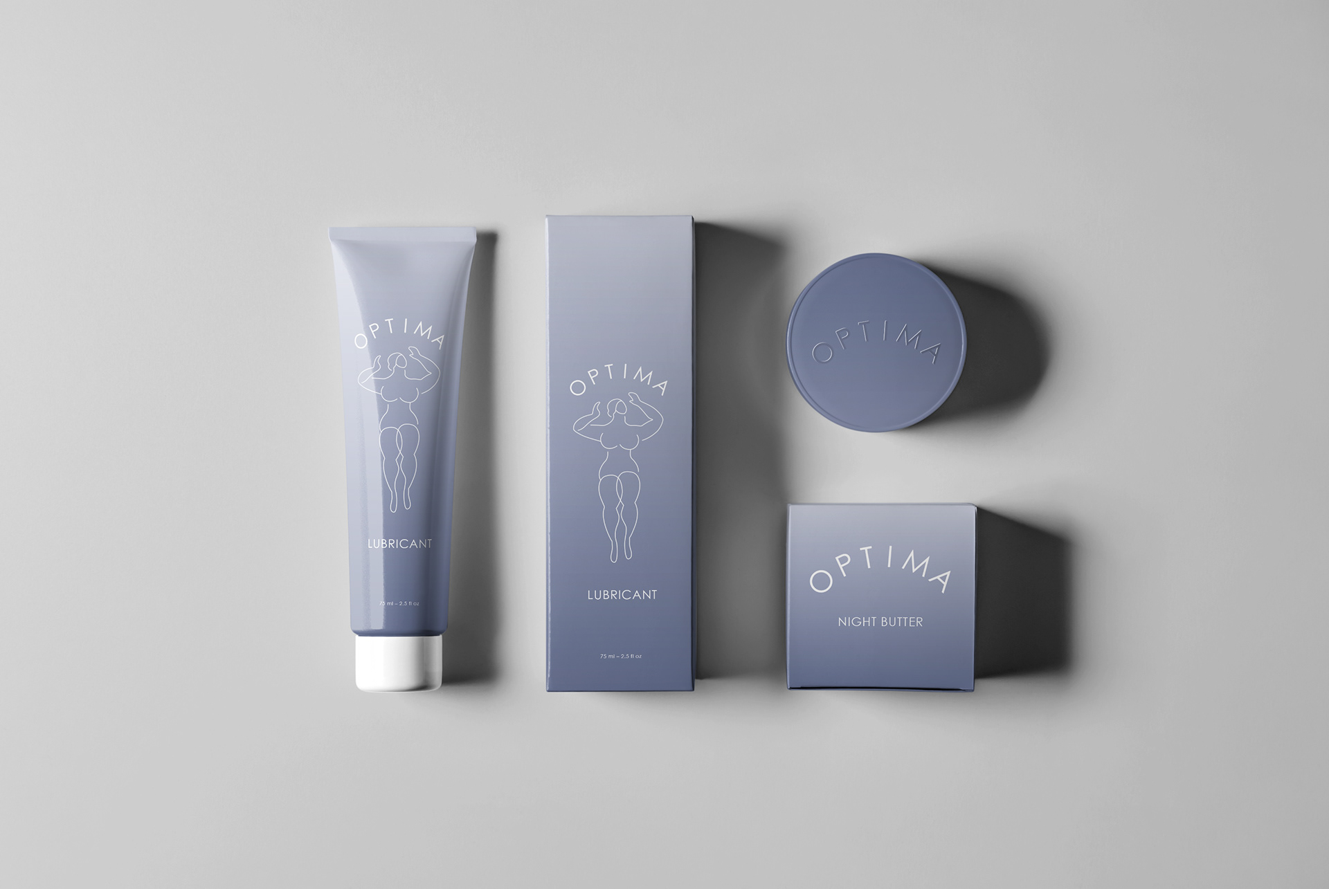
Packaging design for a Sensual Night
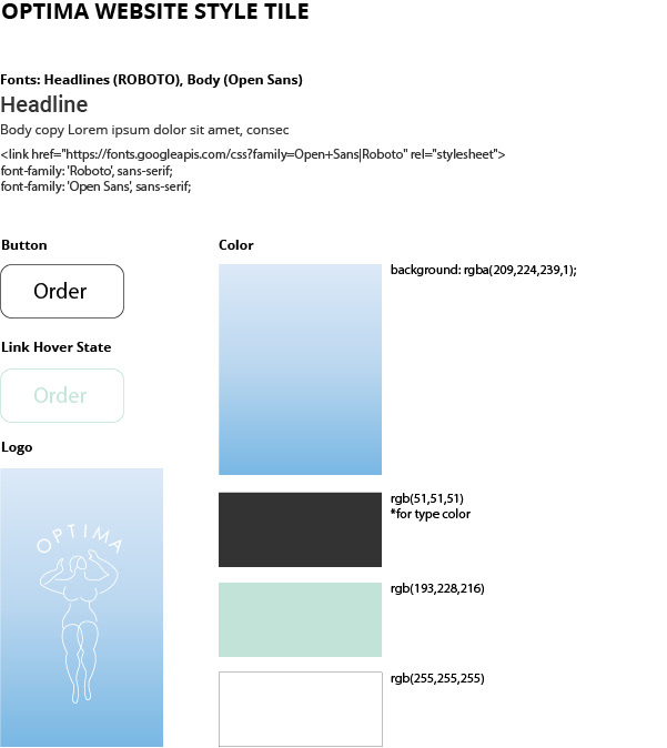
Website Style tile
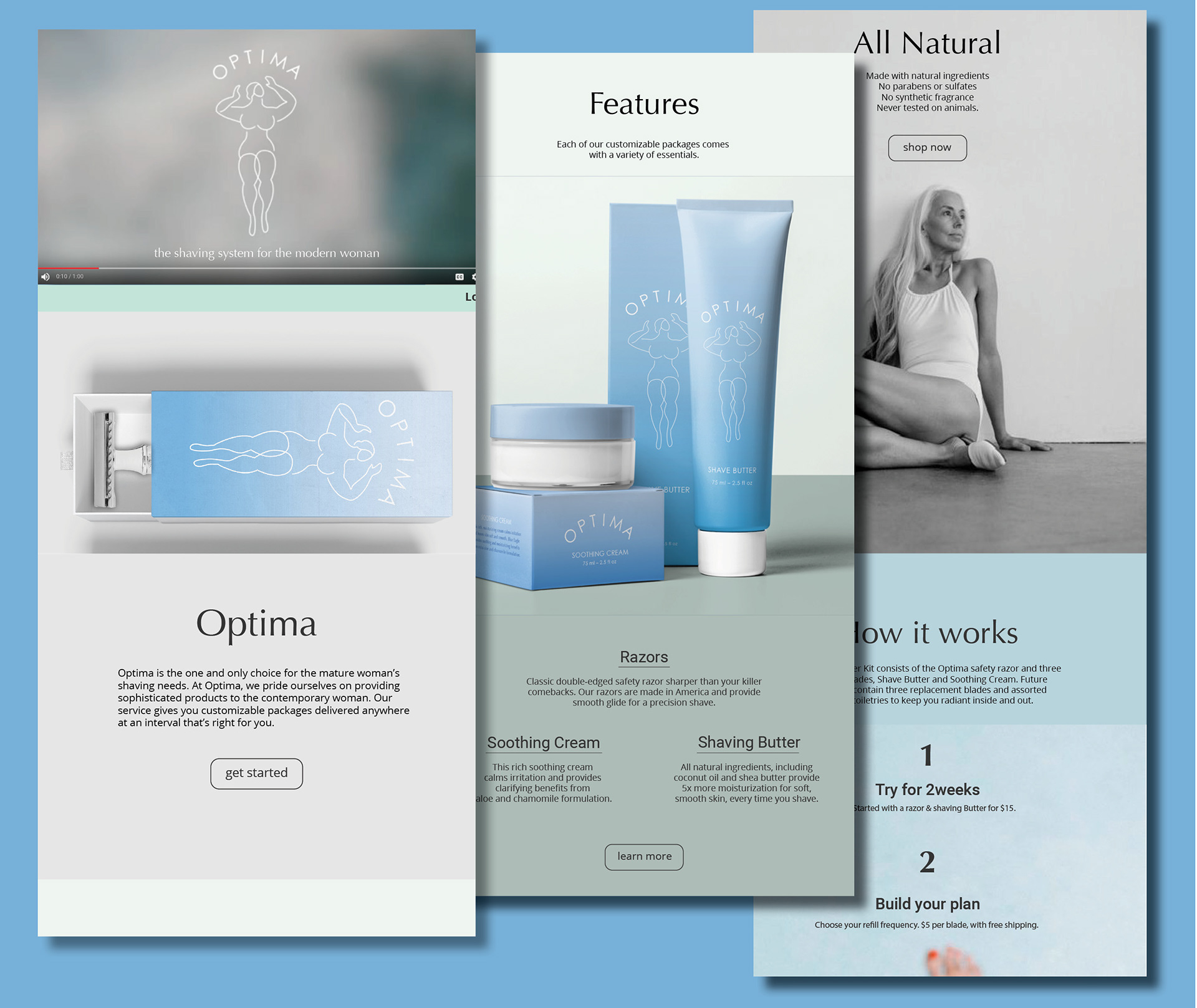
Landing page

Web design